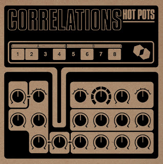
New joint project from DJ Food and Howlround, under the deliciously sibilant and resonant alias The Superceded Sounds of… The New Obsolescents... released shortly on the equally sibilant imprint Castles In Space.
What is immediately striking is the silver metallic artwork with which the releases are gorgeously clad... triggering erogenized memory-rushes for those of a "lost future" fetishising disposition.
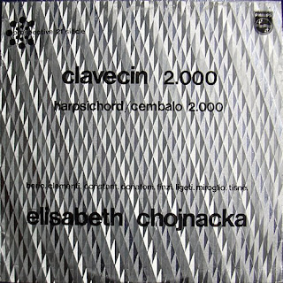
For the process involved, known as Héliophore, is the self-same one used for the beyond-iconic covers of the Prospective 21e Siècle series of electronic avant-garde and musique concrète LPs released by Philips in the late 1960s.

As Food, a.k.a. Strictly Kev explains, he has been fantasizing about making a record with this kind of cover since stumbling across the Prospective series while touring Europe in the '90s:
“The patterns etched in the covers are achieved by minute differences in the angles of the foil coating which then reflects the light and appears to animate when moved... Tracking down the company who made the original Philips covers in France led to a dead end as they had long ceased to exist so I gave up hope. Unknown to me a British company had managed to replicate the process under the name Dufex in the UK. Sadly they’d also wound up business in 2019 but via a chance encounter on a separate project I managed to find the final stocks of card from the business at a lighting company. Once The New Obsolescents’ album was in the bag we started to think about artwork and I knew that this collision of tape loops and turntablism was the perfect record to sleeve in foil as a homage to the Philips series.... Procuring 300 sheets in five different designs, I gave them to Jonas Ranson at paperHAUS who carefully but expertly screen printed each panel with the cover design. Each sheet was then cut to a 12”x12” size and painstakingly glued to each sleeve, pressed while drying and sleeved in PVC outers, making sure not to scratch the foil which is extremely delicate. As a nod to the site of the original performance recordings at the Museum of London, with moon rock bean bags and a space travel theme, we decided on a silver and black hybrid moon surface effect for the vinyl. The whole process of making the sleeves probably took longer than the whole album but I couldn’t be happier with the results, it was worth it.”
There are five variants of the foil board sleeves known respectively as “Spiral’, “Starburst’, “Cross’, “Swirls’ and “Hyperspace”
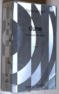
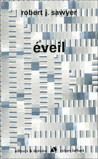
For a text for the exhibition Futur Anterieur, I wrote about the Prospective 21e Siecle covers and how the look inspired similar covers for the French science fiction publisher Ailleurs et Demain (which translates as Elsewhere and Tomorrow)
"In 1969, the publisher Robert Laffont launched the literary equivalent of Prospective 21e Siècle: the imprint Ailleurs et Demain, dedicated to science fiction and under the direction of Gérard Klein. Over the coming years Ailleurs et Demain would publish translations of works by giants of the genre such as Philip K. Dick, John Brunner, Frank Herbert, and Arthur C. Clarke along with novels by French s.f. writers like Jacques Sternberg, Michel Jeury, and Klein himself. Klein was an admirer of the Prospective series and decided to package A & D fiction using the same process, called Héliophore and originally developed in the 1930s by Louis Defay to transform aluminum paper for printing. Some of the Ailleurs Et Demain designs closely resemble specific Prospective 21e Siecle sleeves, while others are new but clearly inspired by the series. (With both the albums and the novels, nobody seems to know the identity of the designers, who were in-house and uncredited). The design style, which eventually extended beyond silver to gold and copper book covers, was maintained for over 20 years, before being abandoned."
More on the Héliophore process at Grapheine


The Superceded Sounds of... release rationale:
This album began life four years ago when the trio of Strictly Kev, Robin The Fog and Chris Weaver were tasked by Jonny Trunk with providing an all-night immersive soundtrack for the mammoth ‘Museum Of Last Parties’ extravaganza in the Museum of London’s Torch Room. Setting up their vintage reel to reel tape machines, turntables and various FX units in the very shadow of the torch that became the icon of the 2012 Olympics, the trio set about creating a soundtrack worthy of champions.Strange new worlds conjured from obsolete media, a vision of the future constructed live using nothing but vintage analogue technology and a sense of adventure.With a constant stream of revellers stopping by to lounge on moon-shaped cushions and enjoy this interstellar soundtrack being woven right before their ears, the trio amassed almost four hours of improvised oddities that night. It wasn’t until the spring of 2020 when they suddenly each found themselves at home with all plans cancelled and a LOT of spare time that the tapes were resurrected and the album started to take shape.
(Hat tip Bruce Levenstein and Andrew Parker)
^^^^^^^^^
While checking out the release, I also had a butchers at the recent discography of Castles In Space - mostly clocking the visuals, not so much the audio. I was struck by how they are sticking with the hauntology (the uncanny persistence of H being a recurrent thought-wrinkle here). This was the most striking son-of-Ghost-Box release.
Release rationale:
“Interim Report, March 1997” by Warrington-Runcorn New Town Development Plan is Gordon Chapman Fox’s hymn and homage to the brutalist beauty of Cheshire’s designated new towns of Warrington and Runcorn.
Chapman-Fox grew up in Lancashire, and having been a frequent user of the famous Preston Bus Station in his youth, he was struck by the enormous chasm between the sixties architects utopian vision for what new towns should be and the sticky-floored, piss-streaked reality. He explains: “The more I looked into it, the appeal of these visionary architects grew. It felt like perhaps the most visionary building projects of all post war Britain were some of the estates built in Warrington and Runcorn new towns, these twin towns on either side of the Mersey. The estates of Runcorn were space-age futurist with external plumbing, rounded windows and raised walkways. But as housing, they were a failure. Runcorn was the last great UK modernist, futurist building project built with a community in mind. “Interim Report, March 1979” looks at this interim, this gap between vision and reality.”
At the time of recording the album, he says, “It seemed like there were a lot of ersatz-soundtracks to lost John Carpenter films, or obscure giallo “classics”. I preferred to find inspiration from the surreality of the mundane, hence the creation of Warrington-Runcorn New Town Development Plan. 1979 seemed the perfect point to be located in time, sitting on the razor’s edge between the post-war consensus and the dawn of Thatcherism. As the concept took hold, I tried to format the music according to the capabilities of a small, provincial recording studio in 1979. I limited the number of instruments available, the number of tracks available and so on. This really helped to shape the album and anchor the concept. As a teenager, I was into rock and looking for ever more extreme sounds - AC/DC gave way to Metallica gave way to Carcass. But by the 90s I heard Warp artists and that was me hooked. What they were doing could be far more brutal than anything by four sweaty long-haired guys with guitars. But it could also be funky, beautiful, ethereal, melodic and so much more.”
It’s that ethereality and true sense of time and place that Chapman-Fox has captured so well here. “1979 marked a change in the political and wider culture of British society. The Warrington- Runcorn development marks the swan song of post-war urban planning in the UK – soon the ethos of building better communities would be replaced by Thatcherite “no such thing as society” and “Greed is good” mentality. And look where that got us…“
Well, you can't much more hauntological than that can you? Cut-off point 1979, end of post-war consensus... and the sonic palette is very Pye Audio Corner.
The "H for life" vibe is discernible in some of the other Castle In Spaces releases's artwork too:


No comments:
Post a Comment